Brands are subject to controversy even when it comes to specific issues such as the launch of a logo. The recent discussion involves giants Adidas and Tesla. The sports brand, founded in 1949, is known for its traditional three parallel stripes, a logo officially registered in 1990. The company has filed a lawsuit against Tesla, claiming that the logo of the new Model 3, which also uses three stripes, could cause confusion among consumers.
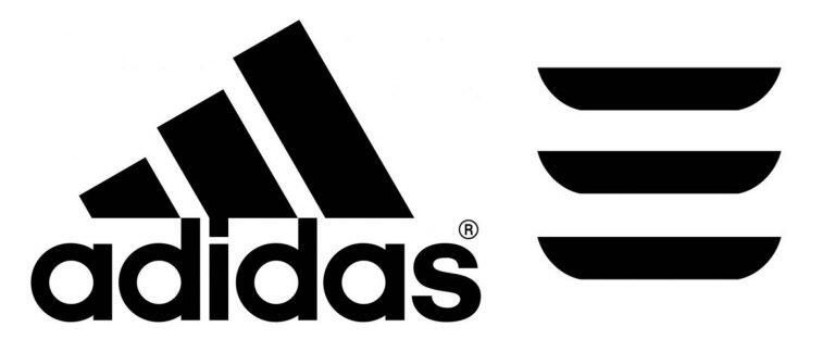

The lawsuit, which was filed on February 3 by Adidas' lawyers in North America with the US Patent and Trademark Office, has already caused Tesla to backtrack and announce that it will change its logo. Instead of the three parallel stripes, it will be a number three. According to Tesla founder Elon Musk, the new logo will not be graphic, but numerical.
"The design of the three stripes common to the applicants' brands resembles the three stripes of the Adidas brand, and may cause abundant confusion, may be misleading, and may be a source of deception as to the origin and sponsorship of the brand's goods," says the German brand's petition.
This isn't the first time that companies have gotten into trouble over their logos. At the beginning of January, in addition to being heavily criticized by soccer fans, the new Juventus shield even generated insinuations of plagiarism.
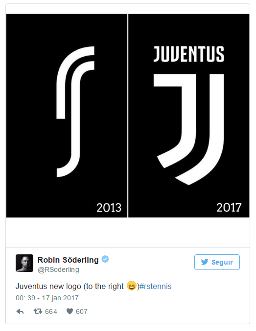

Former tennis player Robin Söderling published a photo of the Italian club's new symbol next to the logo of its sportswear brand, "RS", making fun of the similarity between the artwork.
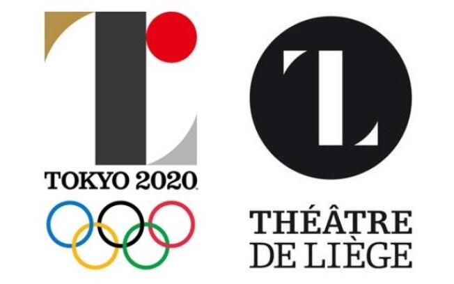
In 2015, just before the Rio 2016 Olympic Games, the Tokyo 2020 Organizing Committee was also accused of plagiarism and had to change the competition's logo. In September 2015, the design created by Kenjiro Sano was removed from the official documents by the local committee because it resembled Olivier Debie's design for the Theatre of Liege in Belgium.

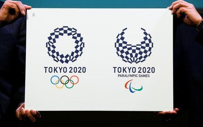
The following year, after a competition involving more than 10,000 designs, the committee presented a new design that was chosen by the public. The winning design, by local artist Asao Tokolo, 49, refers to the "ichimatsu moyo" checkerboard pattern created by the Japanese during the Edo period, from 1603 to 1867. The mark, in indigo blue, expresses "refined Japanese elegance and sophistication", according to the project description on the Games website.

Controversy has also affected Brazilian brands. During the celebration of the 30th anniversary of Criança Esperança in 2015, Rede Globo de Televisão was accused of plagiarism for the program's new logo. The complaints came from The New Hampshire, which curiously enough is a children's museum located in the city of Dover, in the United States.
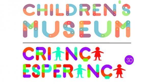

At the time, the company backtracked and said that the program would continue with the original logo and that the one presented was just an evolution of the previous one, which was also colored. The broadcaster also said that the colors used refer to the channel's logo, which has the colors of the rainbow
Source: https://www.meioemensagem.com.br/home/marketing/2017/02/14/quando-um-novo-logotipo-vira-motivo-de-polemica.html

